|
Tutorial #1
Example tutorial by Sh'ar
In this tutorial I just wanted to show the general idea of a tutorial that you can submit.
Basically you provide the steps of how you created some picture, whether it was pixeled, drawn in PhotoShop, drawn with a pencil or anything else.
The purpose of such tutorials is to help beginners in a search for their own techniques of developing a graphic piece.
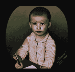
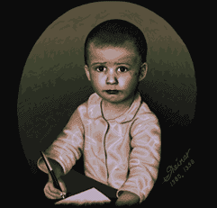
I'll show how I created my picture "1980" using Grafx 2.
It is obviously not the only way to pixel pictures. I'm just trying to show how I created this particular picture and I hope that after reading through this document people who never pixeled will understand the basics of how to create a picture in Grafx 2.
Like most artists who draw people I used a photograph as a reference.
It was an old black and white photograph of myself at the age of two.
Photographs are usually a very good starting point for a picture, and I don't mean scanned or traced over. I mean that they give you some ideas and inspiration
as well as show the aspects of light, shadow and colors on physical objects.
|
Step 1

|
Step 1
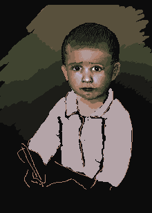
Unfortunately I don't have the very first outline I created. When I saved my first step it already had the face pretty much defined (even though later it got modified quite a lot).
First I made up some palette - at the beginning it was a simple 16 step gradation from black to white. On the pictures in this document you can only see the final palette. Then I created the basic outline, leftovers of which you can still see on the hand with a pen. Then I started defining the areas of color using 1 pixel brush and moving through the colors using ' [ ' and ' ] '. If you zoom into the face you might notice that those areas are still pretty crude.
|
|
Step 2

|
Step 2
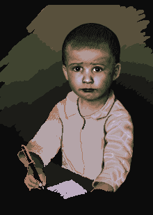
I continued on refining the face - modified the features a little bit (changed the form of the face a bit, widened the lips), started dithering the gradations of the colors since I only had 16 of them. Then defined the colors of the hand with a pen and started on detailing the left arm of the baby.
|
|
Step 3

|
Step 3
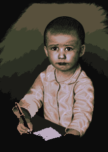
Here I added even more details to the coat. And further improved the face. I had to lighten the nose a bit since it was standing out of the face way too much. Unfortunately the the changes in the face are difficult to notice. The best way to do it would be to load the images in QPV or SEA or some other viewer and switch between them back and forth.
For adding smaller details I used shading mode/effect of Grafx 2. Thus I had left mouse lightening the pixel and right mouse button darkening it. this way I didn't have to use keyboard to switch between the colors.
|
|
Step 4

|
Step 4
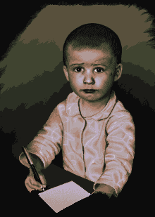
This step shows the improvements on the hand holding a pen. Hands, as many would agree, are probably the most complicated part of human body to draw due to their complicated from, proportions and the number of ways they can be positioned.
|
|
Step 5

|
Step 5
Suddenly I understood that the image doesn't fit into 320x240 and is too small for 640x480, and that it's not very comfortable for viewing. So I decided to resize it up to 640x480. This meant almost a total repixeling of the details and remaking of all the dithering. I resized the image in PhotoShop with bicubic interpolation and saved it back into GIF. In Grafx 2 I fixed the palette that was messed up by PhotoShop.
This step shows the result of those actions. Click on the image to see it in full size. You can see that it's very blurry and grainy.
|
|
"1980"

|
"1980"
This is the final picture that I actually submitted on Assembly 98 where it took 8th place. Click on it to see it in full size.
|
Designed and maintained by Sh'ar.
1998-2000

|


